Subject & Problem
The challenge was establishing unique brand identities for numerous townhouse communities: Hamlet, Soren, Lytle Creek. The client sought a cohesive visual style that harmonized and was recognizable with the overall brand image, giving an expensive and reliable feel.
Solution
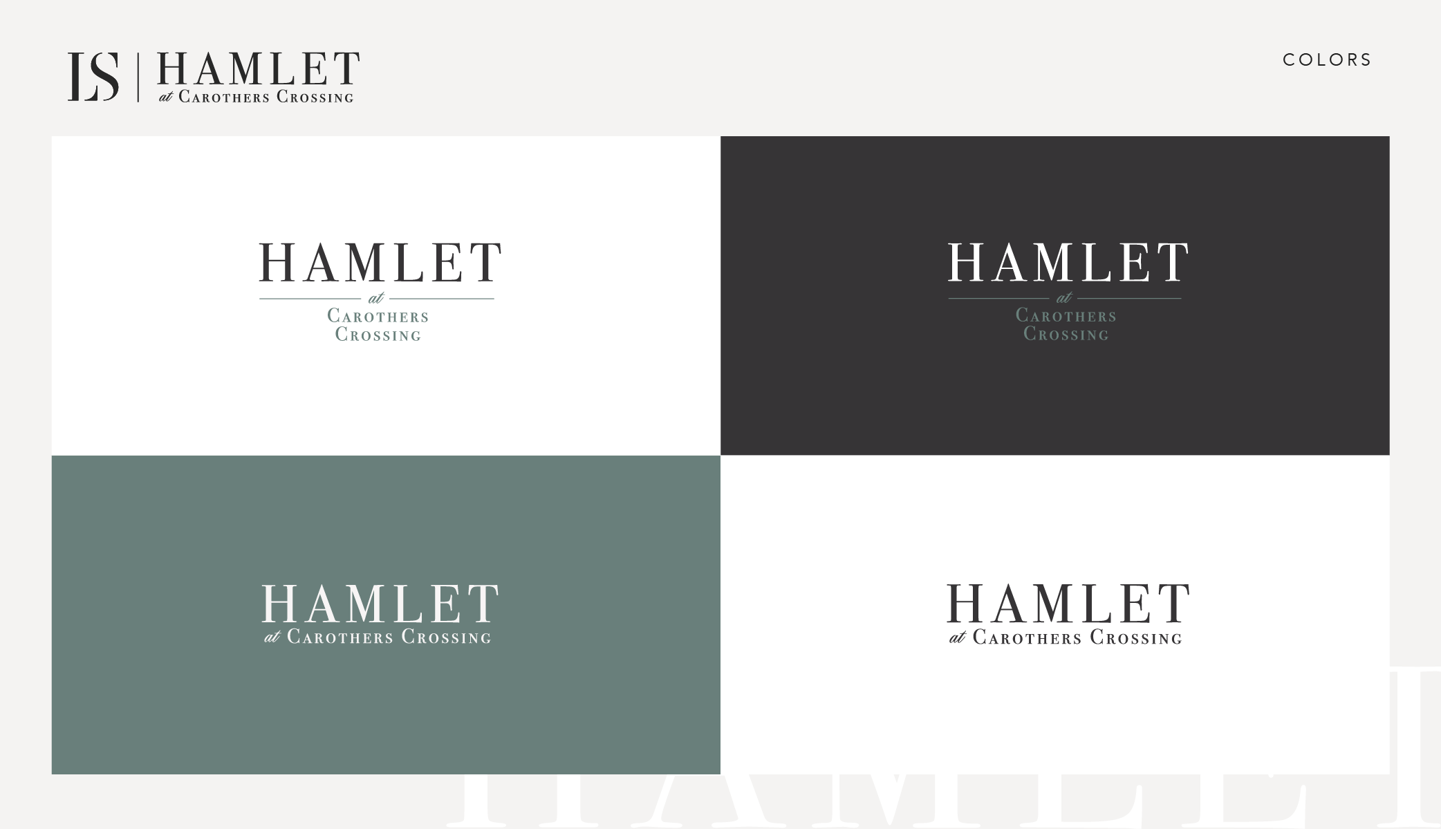
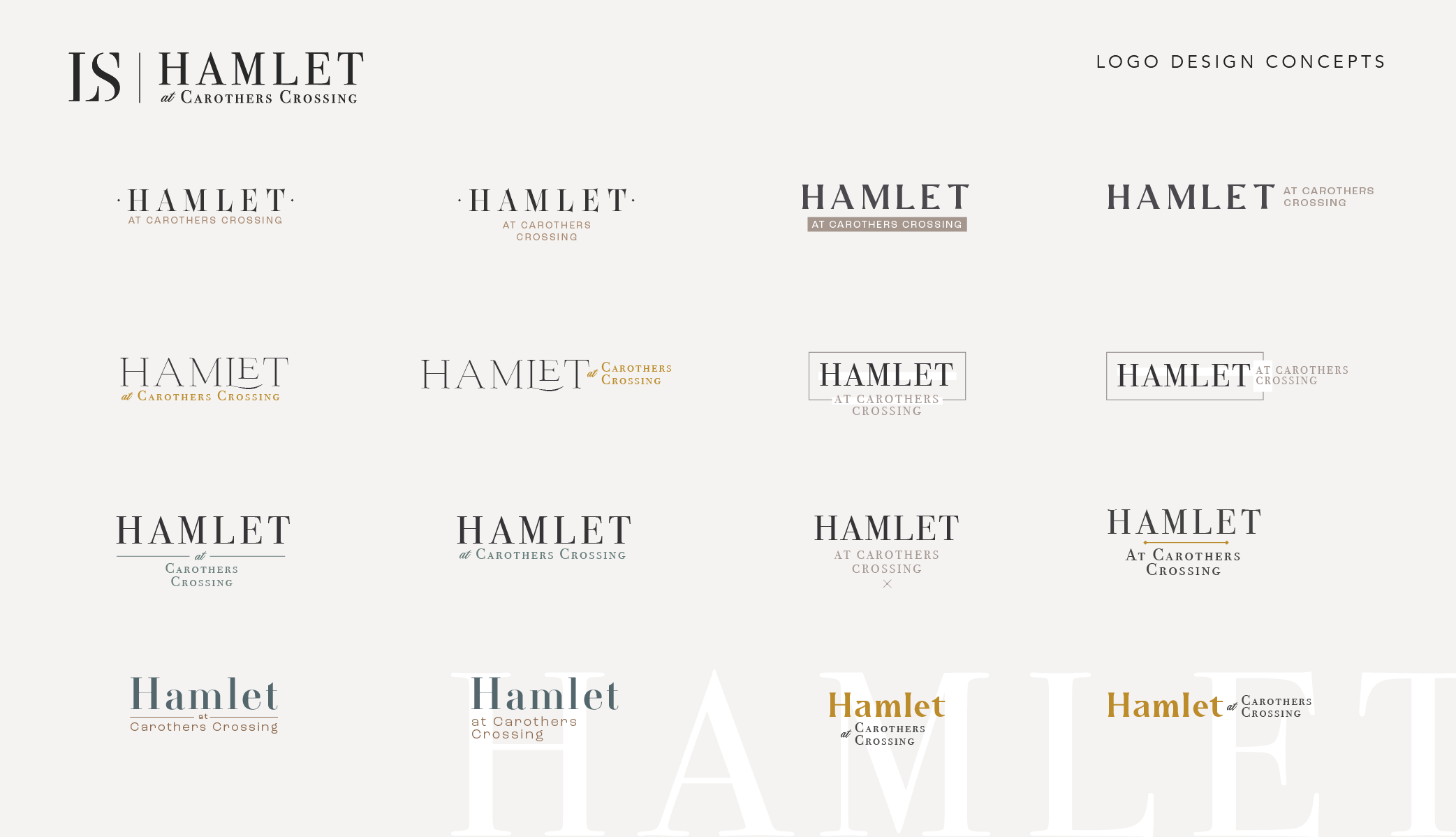
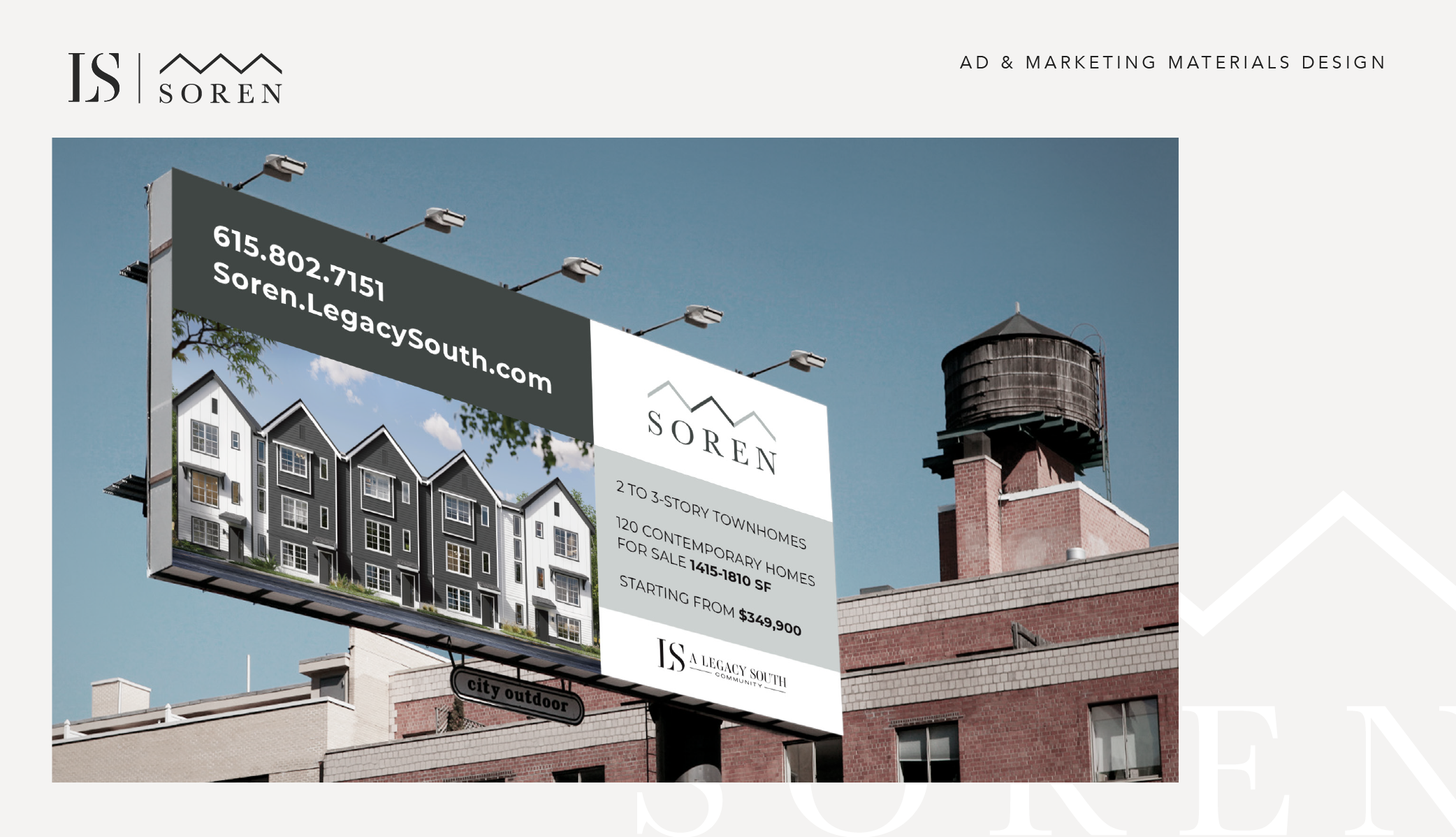
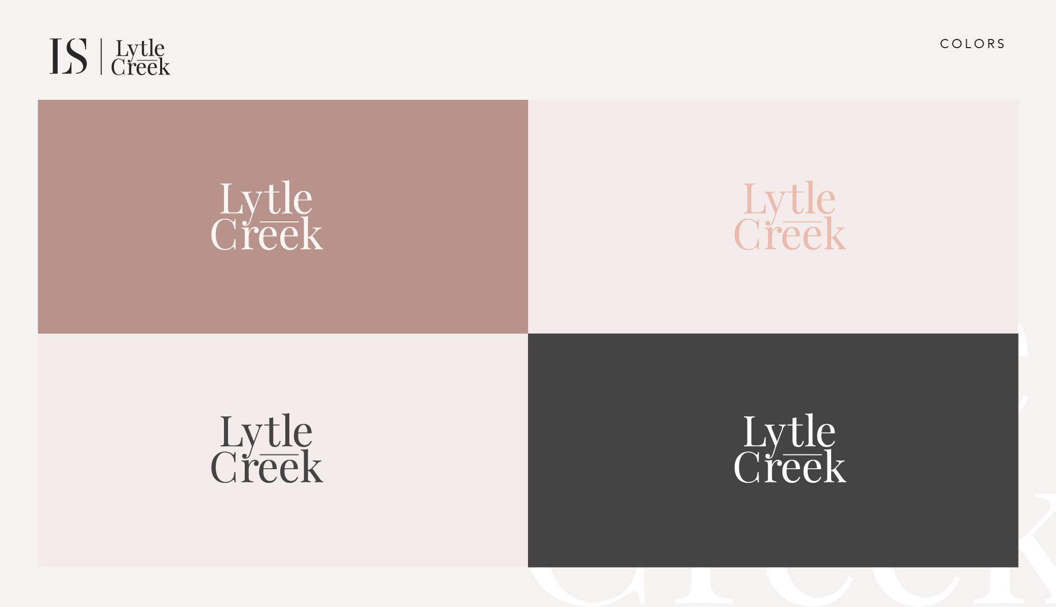
Using their main logo as a reference I made distinctive and recognizable styles for each community, featuring discreet colors, elegant typefaces, and a minimalistic style.
Outcome
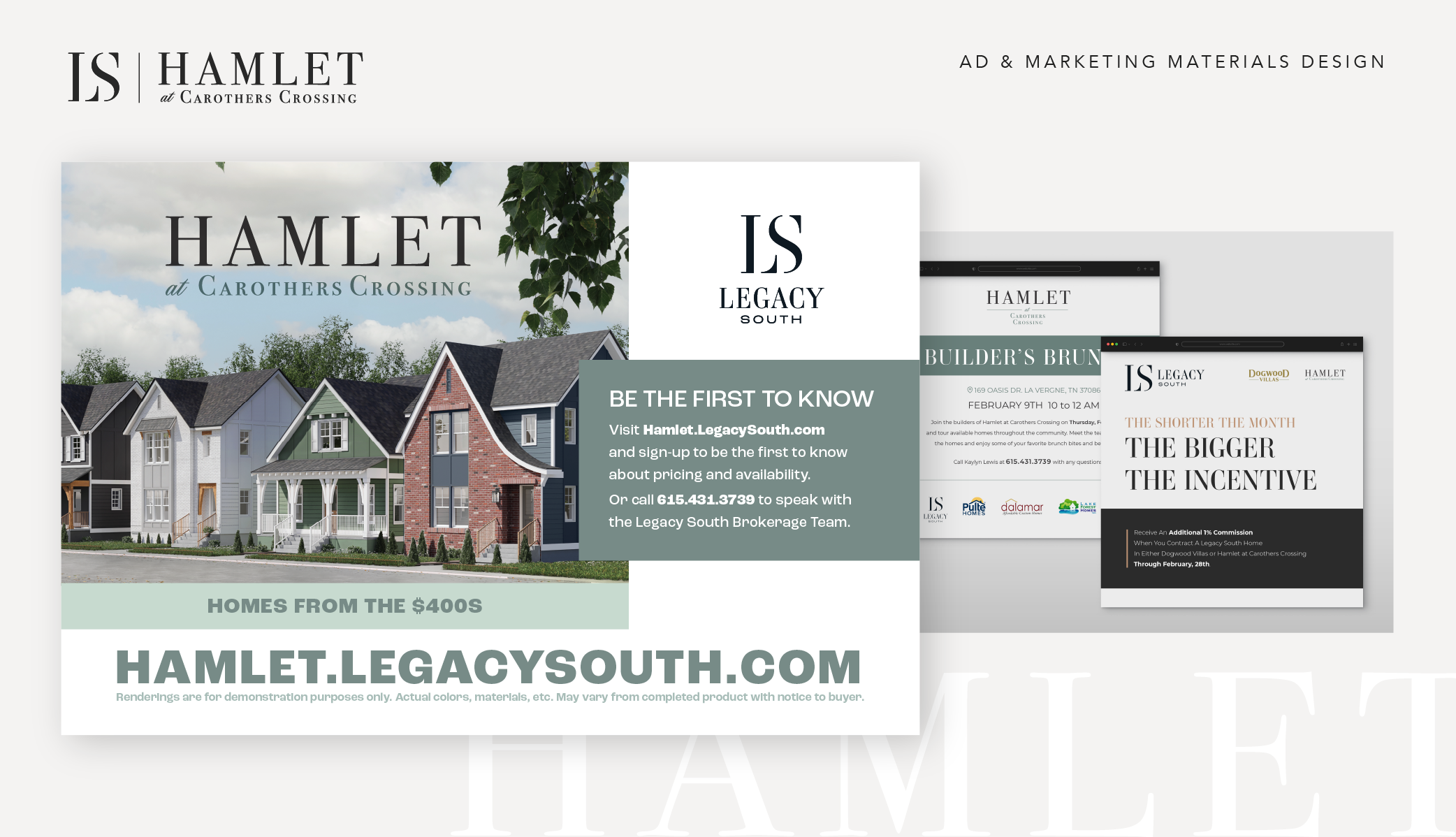
The project also included design for their marketing materials, signs, outdoor advertising, etc. The outcome was an impactful brand presence across various touchpoints, reinforcing the property’s image.